Pages
Home
The Home section of the Skin Config allows you to customize the appearance and functionality of the homepage.
Marquee (News Feed)
The Marquee (News Feed) section allows you to configure the scrolling marquee feature on the homepage. Customize the font style, height, size, color, and background of the marquee to create an engaging and visually appealing news feed.
-53b0352a2ec3937c14a62e878f2d0abd.png)
- Marquee Font Style: Choose the font style for the scrolling marquee text.
- Marquee Height: Set the height of the marquee area to control how much vertical space it occupies.
- Marquee Font Size (Desktop, Mobile): Specify the font size for the marquee text on desktop and mobile devices to ensure readability across different screen sizes.
- Marquee Text Color: Select the color of the text in the marquee to match your design preferences.
- Marquee Background: Define the background color or image for the marquee area to enhance its visual appeal.
Member Auth
The Member Auth section allows you to customize the authentication interface for members, both before and after they sign in. This includes configuring visual elements such as text color, font styles, backgrounds, and button images to enhance the user experience and align with your brand’s aesthetic.
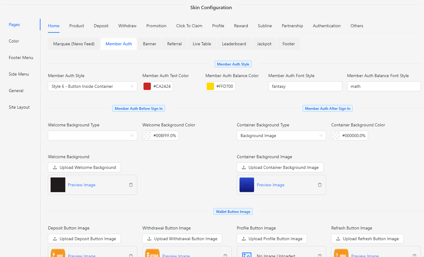
- Member Auth Style: Choose from 6 different styles to define the overall look and feel of the authentication page.
- Member Auth Text Color: Set the color for the text on the authentication page.
- Member Auth Balance Color: Choose the color for the balance display on the authentication page.
- Member Auth Font Style: Define the font style used for text on the authentication page.
- Member Auth Balance Font Style: Customize the font style specifically for balance information on the authentication page.
- Welcome Background Type: Select the background type for the welcome screen, such as solid color or image.
- Welcome Background Color: Choose a solid color for the welcome screen background, if applicable.
- Welcome Background: Upload an image or choose a pattern for the welcome screen background.
- Container Background Type: Define the background type for the container after sign-in, including options like solid color, gradient, or image.
- Container Background Color: Set the color for the container background, if a solid color is chosen.
- Container Background Image: Upload an image to serve as the background for the container post sign-in.
- Deposit Button Image: Set an image for the deposit button.
- Withdrawal Button Image: Set an image for the withdrawal button.
- Profile Button Image: Set an image for the profile button.
- Refresh Button Image: Set an image for the refresh button.
- Login Button Image: Set an image for the login button.
- Register Button Image: Set an image for the register button.
Banner Style
The Banner Style section allows you to customize the banners displayed on the home page, enhancing the visual appeal and functionality of your site. You can choose between two banner styles, configure various banner images, and set up URLs for payment banners, sticky buttons, and floating icons, ensuring that all visual elements align with your brand's aesthetic.
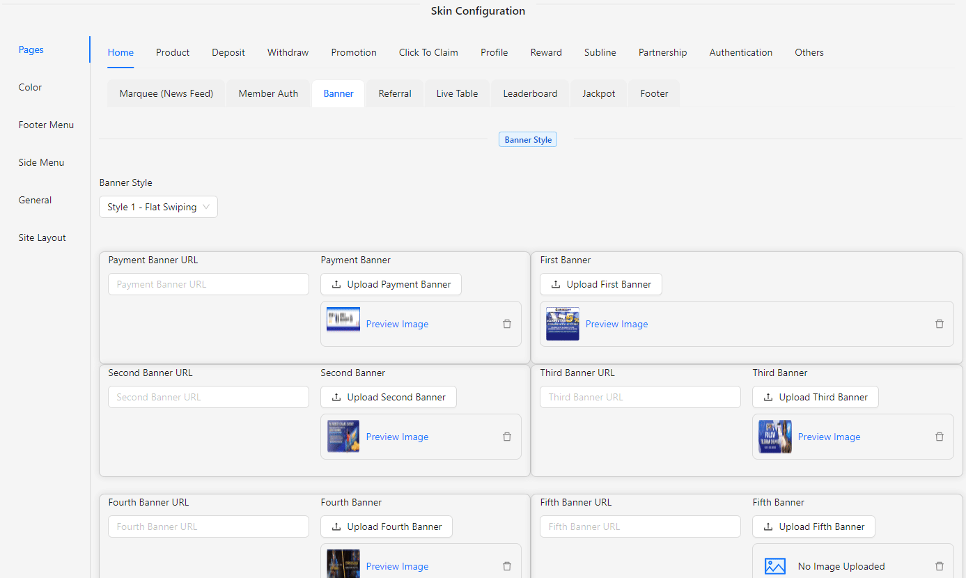
- Banner Style: Select from two available styles for the home banner:
- Style 1 - Flat Swiping: A flat, swipeable banner style.
- Style 2 - 3D Square Image: A 3D effect banner with square images.
- Payment Banner URL: Enter the URL for the payment banner.
- Payment Banner: Upload the image for the payment banner.
- First Banner: Upload the first banner image.
- Second Banner URL: Enter the URL linked to the second banner.
- Second Banner: Upload the second banner image.
- Third Banner URL: Enter the URL linked to the third banner.
- Third Banner: Upload the third banner image.
- Fourth Banner URL: Enter the URL linked to the fourth banner.
- Fourth Banner: Upload the fourth banner image.
- Fifth Banner URL: Enter the URL linked to the fifth banner.
- Fifth Banner: Upload the fifth banner image.
- Floating Icon URL: Enter the URL for the floating icon.
- Floating Icon: Upload the floating icon image.
- First Sticky Button URL: Enter the URL for the first sticky button.
- First Sticky Button: Upload the first sticky button image.
- Second Sticky Button URL: Enter the URL for the second sticky button.
- Second Sticky Button: Upload the second sticky button image.
- Banner on Top of Footer URL: Enter the URL for the banner located at the top of the footer.
- Banner on Top of Footer: Upload the image for the banner on top of the footer.
Referral
The Referral section allows you to configure and customize referral features on your home page, providing users with convenient access to share and manage their referral links. This section lets you choose referral layouts, set up buttons and their sequences, and upload images for sharing options, ensuring that your referral system is visually appealing and easy to use.
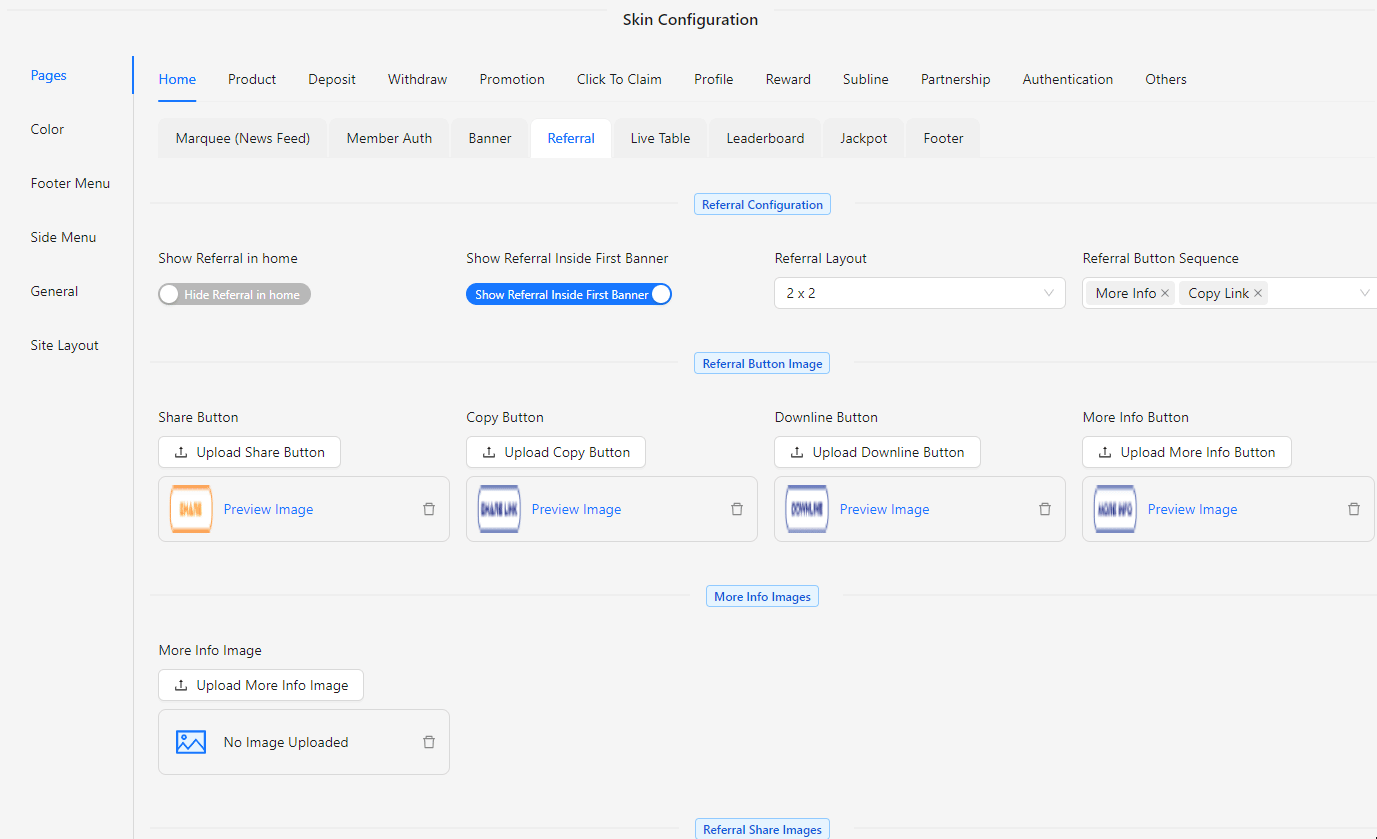
- Show Referral in Home: Enable or disable the display of the referral feature on the home page.
- Show Referral Inside First Banner: Enable or disable the inclusion of the referral feature within the first banner.
- Referral Layout: Choose the layout for displaying referral options:
- 1 x 4: A single row with four buttons.
- 2 x 2: A grid layout with two rows and two buttons per row.
- Referral Button Sequence: Set the order of the referral buttons:
- Copy Link
- Downline
- More Info
- Share
- Referral Button Image: Upload images for each referral button:
- Share Button
- Copy Button
- Downline Button
- More Info Button
- More Info Images: Upload the image for the More Info section.
- Referral Share Images: Upload images for the sharing options, including:
- Telegram
- Live Chat
- QR Code
Live Table
The Live Table section allows you to configure and customize live table features on your home page. This section provides options to enable or disable the live table display, select the table type, and fine-tune various visual and data aspects to ensure the live table integrates seamlessly with your site's design and functionality.
- Show Live Table: Enable or disable the display of the live table on your home page.
- Live Table Type: Choose the type of live table, such as Style 1 (Deposit & Withdrawal), to display relevant data.
- Live Table Container Color: Set the background color of the live table container to match your design.
- Live Table Deposit Color: Define the color for deposit entries in the live table.
- Live Table Deposit Player Text Color: Specify the text color for player names in the deposit entries.
- Live Table Deposit Text Color: Set the text color for deposit amounts displayed in the live table.
- Live Table Product Text Color: Choose the text color for product names associated with the transactions.
- Live Table Withdrawal Color: Define the color for withdrawal entries in the live table.
- Live Table Withdrawal Player Text Color: Specify the text color for player names in the withdrawal entries.
- Live Table Withdrawal Text Color: Set the text color for withdrawal amounts displayed in the live table.
- Live Table Dummy Data Game: Input dummy game data (e.g., ABC, DEF) for testing or display purposes.
- Live Table Dummy Data Random Init: Set initial random values for dummy data (e.g., 10) to simulate dynamic updates.
- Live Table Dummy Data Random Multiplier: Define random multipliers for dummy data (e.g., 300) to add variability in displayed data.
Leaderboard
The Leaderboard section allows you to configure and customize the leaderboard features on your home page. This section provides options to enable or disable the leaderboard display, select specific games, and adjust various visual and data settings to ensure the leaderboard integrates seamlessly with your site’s design and functionality.
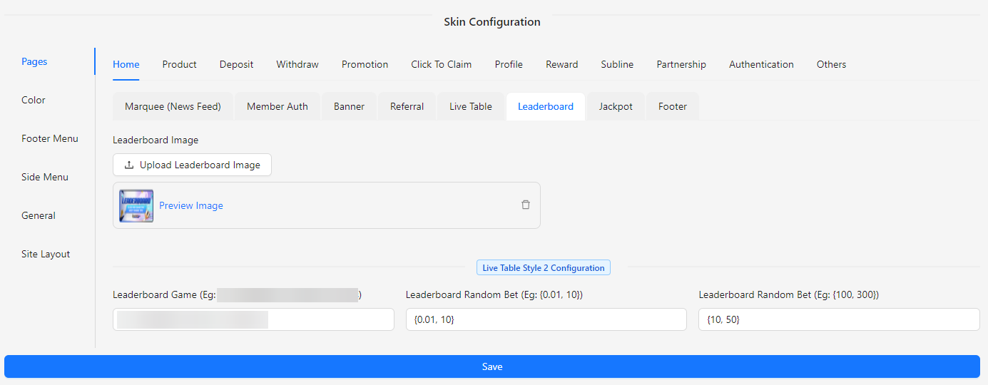
- Leaderboard Image: Upload or select the image to be displayed as part of the leaderboard.
Live Table Style 2 Configuration
- Leaderboard Game: Choose the games to be included in the leaderboard (e.g., ABC, DEF, GHI, JKL).
- Leaderboard Random Bet: Set the range for random bet amounts to be displayed on the leaderboard (e.g., 10).
- Leaderboard Random Multiplier: Define the range for random multipliers applied to bet amounts on the leaderboard (e.g., 300).
Jackpot
The Jackpot section allows you to configure and customize the jackpot features on your home page. This section provides options to enable or disable the jackpot display, choose from different jackpot styles, and adjust the visual elements and increment settings to ensure the jackpot feature integrates seamlessly with your site’s design and functionality.
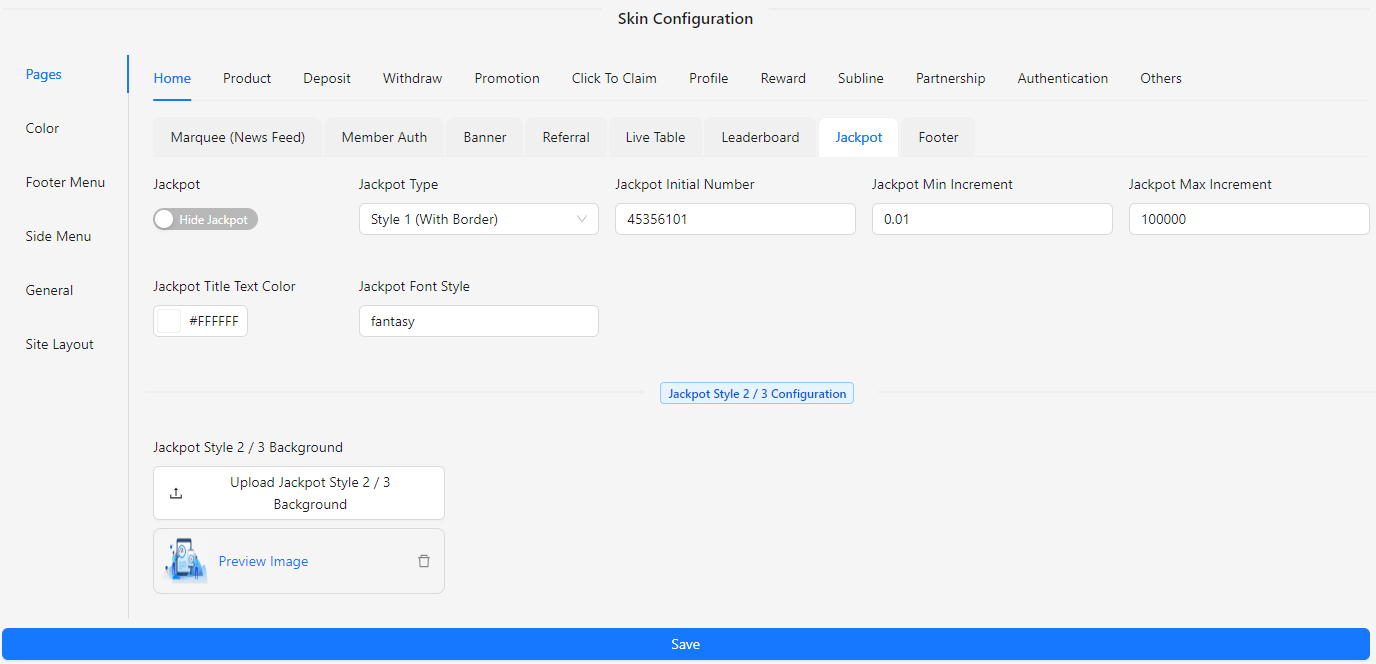
- Jackpot: Enable or disable the jackpot display on your home page.
- Jackpot Type:
- Style 1 (With Border): A bordered style for the jackpot display.
- Style 2 (Image Border): A style featuring an image border around the jackpot.
- Style 3 (Logo on Left): A style where the logo is placed on the left side of the jackpot.
- Jackpot Initial Number: Set the initial number for the jackpot display.
- Jackpot Min Increment: Define the minimum increment value for the jackpot.
- Jackpot Max Increment: Define the maximum increment value for the jackpot.
- Jackpot Title Text Color: Choose the color for the jackpot title text.
- Jackpot Font Style: Select the font style for the jackpot text.
- Jackpot Style 2 / 3 Background: Upload an image to be used as the background for Style 2 or Style 3 jackpot displays.
Footer
The Footer section allows you to configure and customize the footer of your home page. This section provides options to enable or disable the footer display and define the content that appears in the footer, ensuring it aligns with your site’s design and enhances user experience.
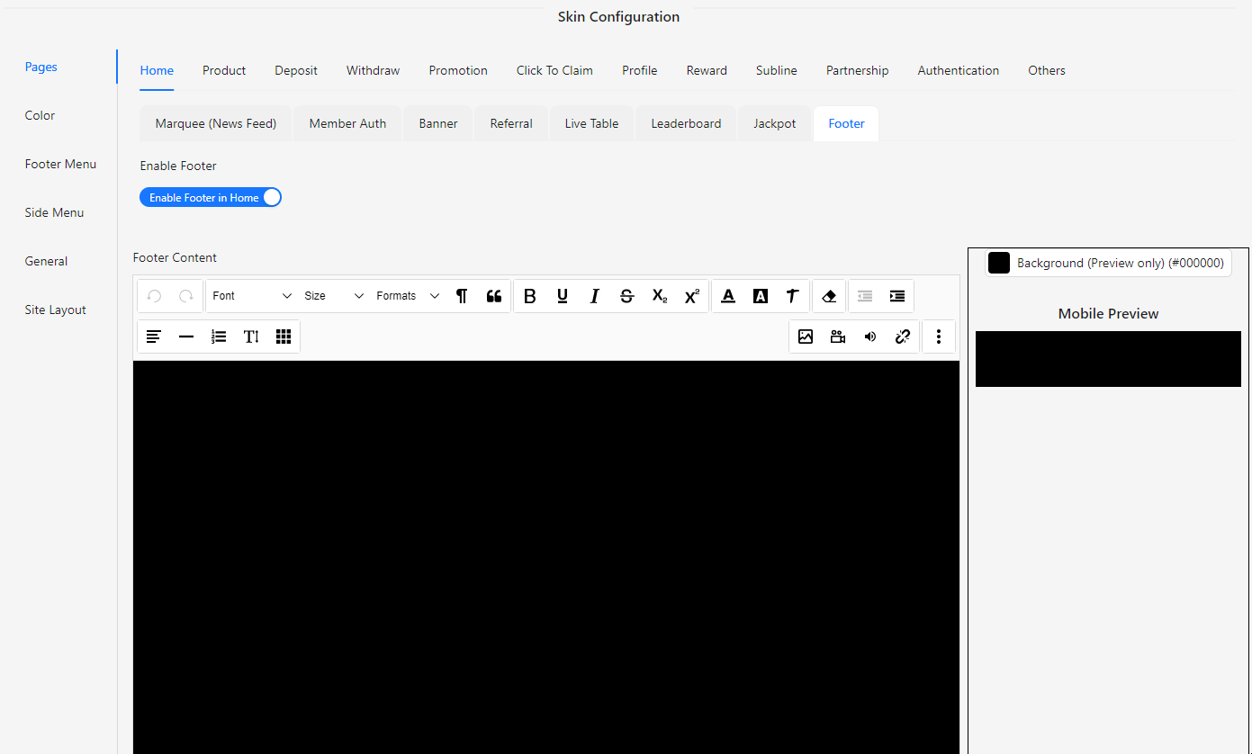
- Enable Footer: Enable or disable the display of the footer on your home page.
- Footer Content: Define the content that will be displayed in the footer, such as links, text, or other elements relevant to your site.
Product
The Product section of the Skin Config allows you to customize the appearance and functionality of the product display on the homepage. This section provides options to manage product categories, set RTP (Return to Player) rates for slot games, and adjust various settings to ensure the product presentation aligns with your site’s design and user experience.
Category
The Category section allows you to configure and customize the category display on your home page. This section provides options to manage the visibility of category labels, select default categories, and adjust the size and layout of category tabs and images. Additionally, you can configure up to 10 category tabs, including the option to show or hide each tab, ensuring that the category presentation aligns with your site’s design and enhances the user experience.
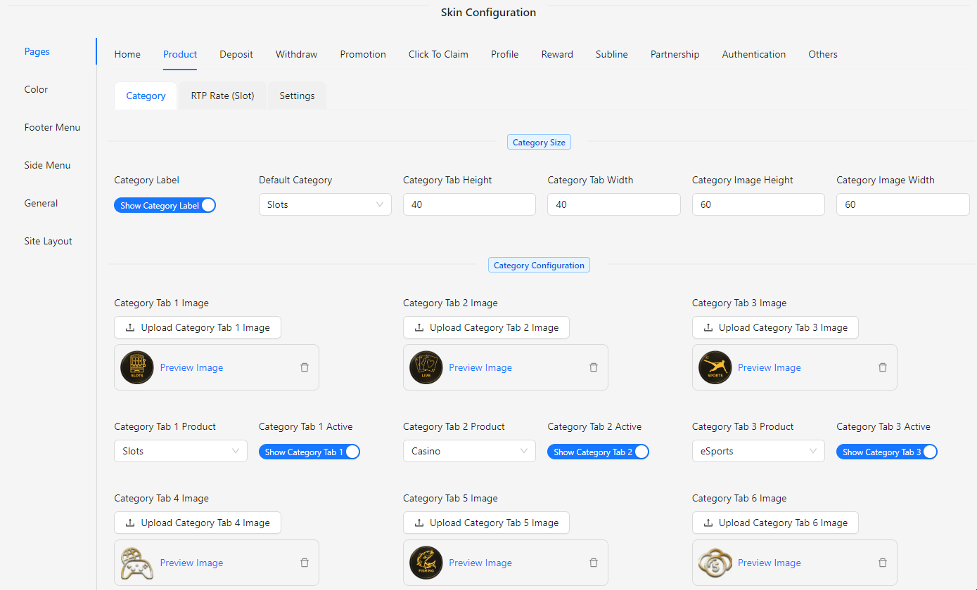
- Category Label: Choose to show or hide the category label on the home page.
- Default Category: Select the default category that will be displayed first.
- Category Tab Height: Set the height of the category tabs.
- Category Tab Width: Set the width of the category tabs.
- Category Image Height: Define the height of the images within the category tabs.
- Category Image Width: Define the width of the images within the category tabs.
- Category Configuration: Configure up to 10 category tabs:
- Category Tab 1-10 Image: Upload an image for each category tab.
- Category Tab 1-10 Product: Assign a product to each category tab.
- Category Tab 1-10 Active: Choose to show or hide each category tab.
RTP Rate (Slot)
The RTP Rate (Slot) section allows you to configure and customize the Return to Player (RTP) settings for slot games. This section provides tools to manage the display of RTP information, including visibility options, RTP range settings, and color customization to enhance the user experience. The RTP rate indicates the percentage of total bets that a slot game is expected to return to players over time.
-4d0c96e2455efba8d781fc8c70f9961d.png)
- Show RTP: Toggle to show or hide the RTP rate on the site.
- Min RTP: Set the minimum RTP value to filter or display slot games.
- Max RTP: Set the maximum RTP value to filter or display slot games.
- RTP Color:
- RTP Range 1-10: Customize color for RTP rates in this range.
- RTP Range 11-20: Customize color for RTP rates in this range.
- RTP Range 21-30: Customize color for RTP rates in this range.
- RTP Range 31-40: Customize color for RTP rates in this range.
- RTP Range 41-50: Customize color for RTP rates in this range.
- RTP Range 51-60: Customize color for RTP rates in this range.
- RTP Range 61-70: Customize color for RTP rates in this range.
- RTP Range 71-80: Customize color for RTP rates in this range.
- RTP Range 81-90: Customize color for RTP rates in this range.
- RTP Range 91-100: Customize color for RTP rates in this range.
Settings
The Settings section allows you to configure and customize various aspects of the slot game presentation and functionality. This section provides options to adjust display settings, game integration, and visual elements to enhance the user experience.
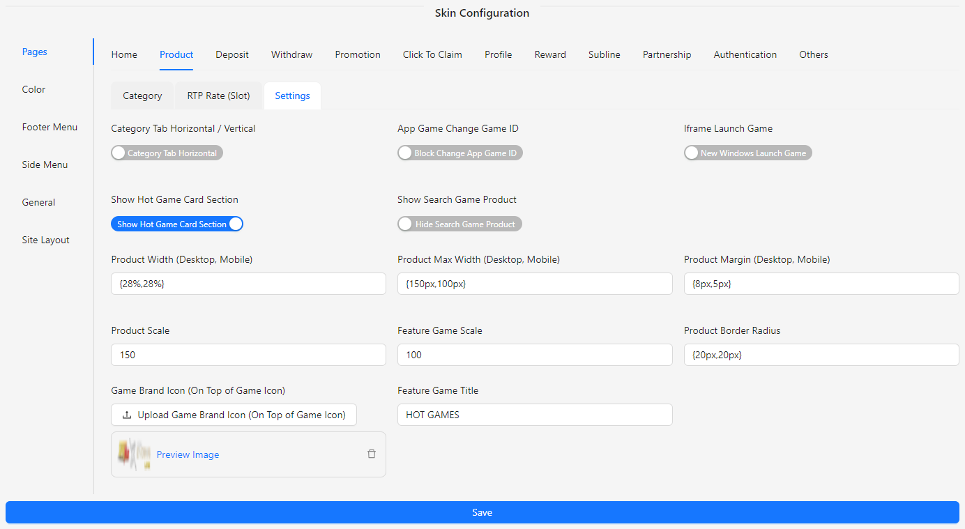
- Category Tab Horizontal / Vertical: Switch between horizontal or vertical category tabs for better layout customization.
- App Game Change Game ID: Toggle to allow or block changes to the app game ID.
- Iframe Launch Game: Choose whether games should be launched in an iframe or in a new window.
- Show Hot Game Card Section: Option to show or hide the section for hot game cards.
- Show Search Game Product: Option to show or hide the search functionality for game products.
- Product Width (Desktop, Mobile): Set the width for product displays on desktop and mobile devices.
- Product Max Width (Desktop, Mobile): Set the maximum width for product displays on desktop and mobile devices.
- Product Margin (Desktop, Mobile): Define the margin for product displays on desktop and mobile devices.
- Product Scale: Adjust the scaling of product images.
- Feature Game Scale: Adjust the scaling of featured game images.
- Product Border Radius: Set the border radius for product display elements.
- Game Brand Icon (On Top of Game Icon): Upload an image to display as a brand icon on top of the game icon.
- Feature Game Title: Customize the title for featured games.
Deposit
The Deposit section of the Skin Config allows you to customize the appearance and functionality of the Deposit page. This section includes options to manage and update images for various payment gateways to ensure that the Deposit page aligns with your site’s design and branding.
Deposit Config
The Deposit Config section allows you to customize various aspects of the Deposit page to ensure it aligns with your site's design and user experience. This section includes options to adjust the layout, upload images for different payment gateways, and configure additional settings.
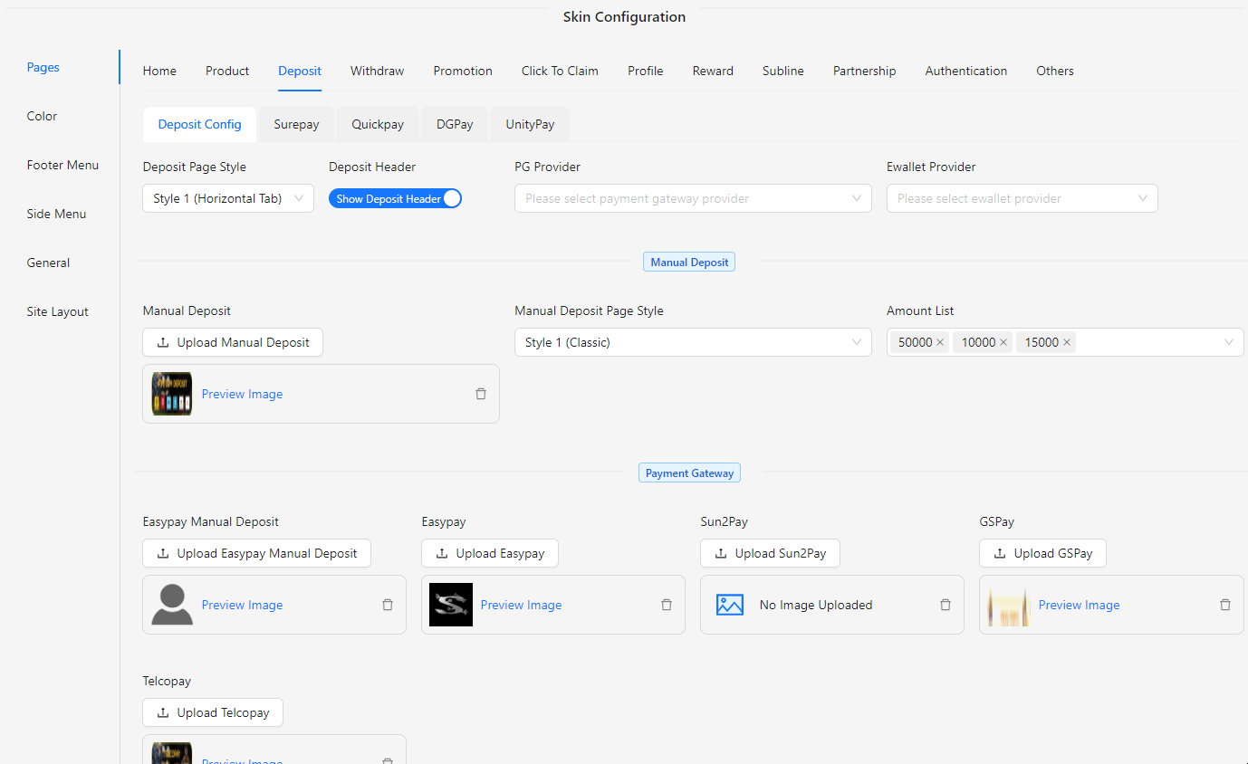
- Deposit Page Style: Customize the layout and appearance of the Deposit page with different styles. Choose from the following options:
- Style 1: Horizontal Tab
- Style 2: Vertical Tab
- Style 3: Top Down
- Deposit Header: Show or hide the Deposit page header.
- PG Provider: Select the payment gateway provider.
- Ewallet Provider: Select the ewallet gateway provider.
- Manual Deposit: Upload an image for manual deposit options.
- Manual Deposit Page Style: Customize the layout and appearance of the manual deposit section on the Deposit page. Choose from the following styles to match your site's design:
- Style 1: Classic
- Style 2: Bordered Bank Acc
- Amount List: Enter the list of deposit amounts.
- Easypay Manual Deposit: Upload an image for Easypay manual deposit.
- Easypay: Upload an image for Easypay payment gateway.
- Sun2Pay: Upload an image for Sun2Pay payment gateway.
- GSPay: Upload an image for GSPay payment gateway.
- Telcopay: Upload an image for Telcopay payment gateway.
Surepay
The Surepay section allows you to upload and manage images for various Surepay-related services on the Deposit page:
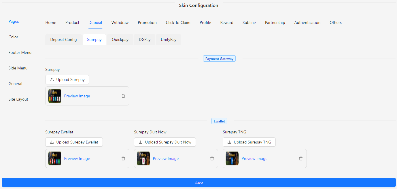
- Surepay Payment Gateway: Upload an image for the Surepay payment gateway to be displayed on the Deposit page.
- Surepay Ewallet: Upload an image for the Surepay ewallet service.
- Surepay Duit Now: Upload an image for the Surepay Duit Now service.
- Surepay TNG: Upload an image for the Surepay TNG (Touch 'n Go) service.
Quickpay
The Quickpay section allows you to upload images and manage Quickpay-related services on the Deposit page:
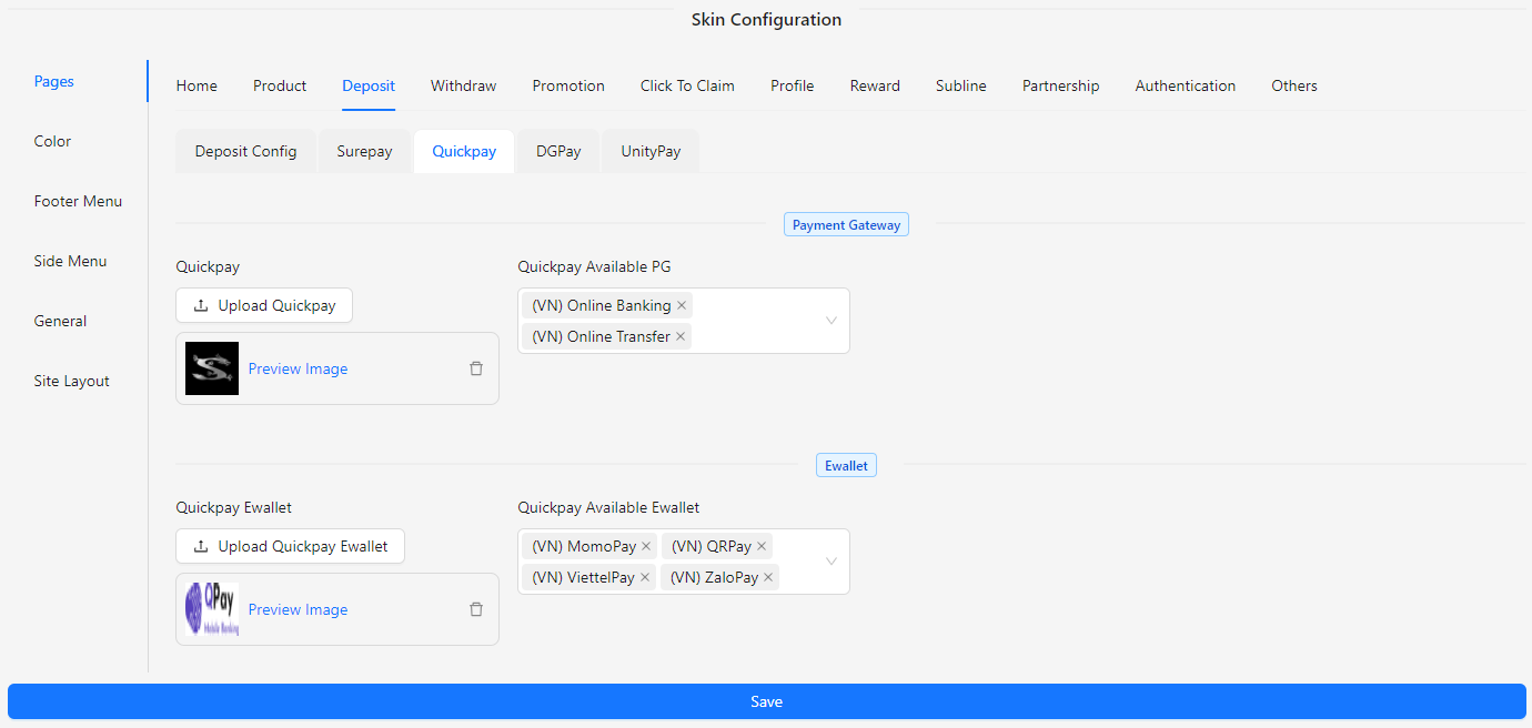
- Quickpay: Upload an image for the Quickpay payment gateway.
- Quickpay Available PG: Select the available payment gateway providers for Quickpay.
- Quickpay Ewallet: Upload an image for the Quickpay ewallet service.
- Quickpay Available Ewallet: Select the available ewallet providers for Quickpay.
DGPay
The DGPay section allows you to upload and manage images for various DGPay-related services on the Deposit page:
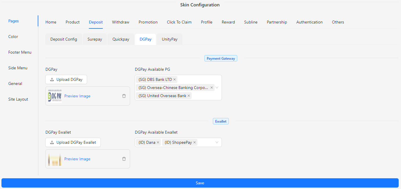
- DGPay: Upload an image for the DGPay payment gateway.
- DGPay Available PG: Select the available payment gateway providers for DGPay.
- DGPay Ewallet: Upload an image for the DGPay ewallet service.
- DGPay Available Ewallet: Select the available ewallet providers for DGPay.
UnityPay
The UnityPay section allows you to upload and manage images for various UnityPay-related services on the Deposit page.
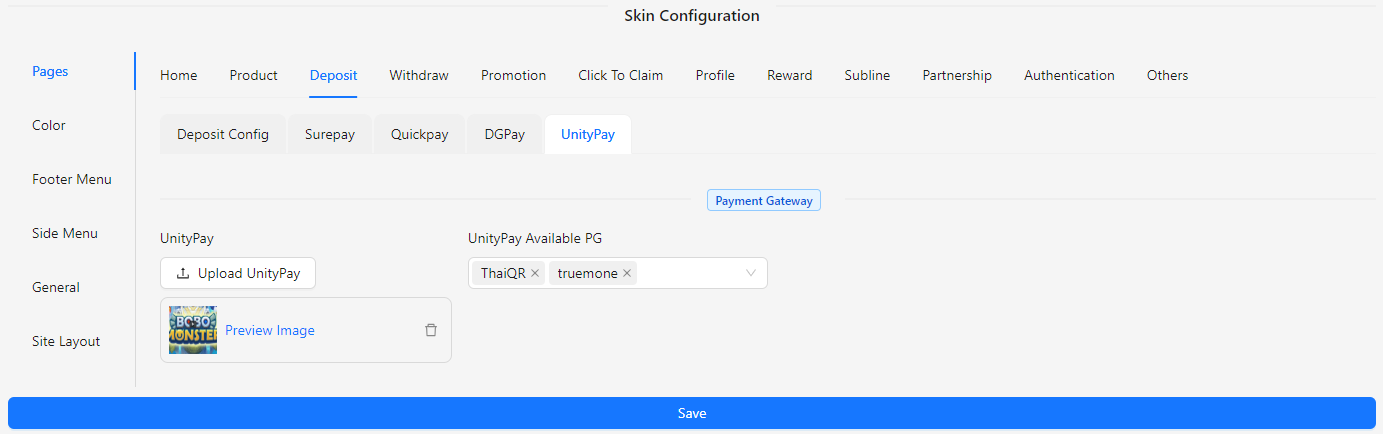
- UnityPay: Upload an image for the UnityPay payment gateway.
- UnityPay Available PG: Select the available payment gateway providers for UnityPay.
Withdraw
The Withdraw section of the Skin Config allows you to customize the appearance and functionality of the Withdraw page. This section includes options to manage and update the layout and visual elements to ensure that the Withdraw page aligns with your site’s design and branding.
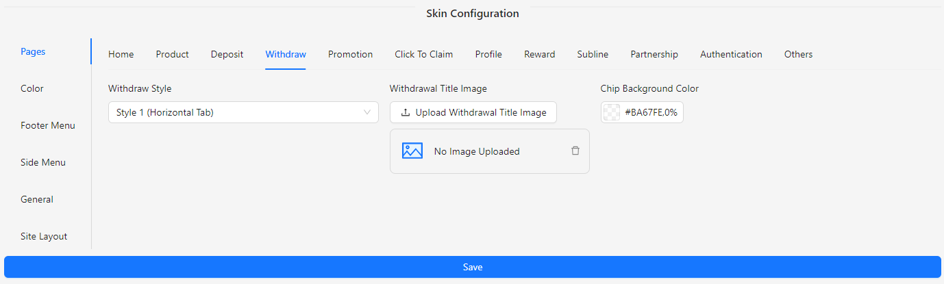
- Withdraw Style: Choose the style for the withdrawal page:
- Style 1: Horizontal Tab
- Style 2: Vertical Tab
- Withdrawal Title Image: Upload an image to be displayed as the title for the withdrawal section.
- Chip Background Color: Set the background color for chip elements on the withdrawal page.
Promotion
The Promotion section of the Skin Config allows you to customize the appearance and functionality of the Promotion page. This section includes options to manage and update the layout and visual elements to ensure that the Promotion page aligns with your site’s design and branding.
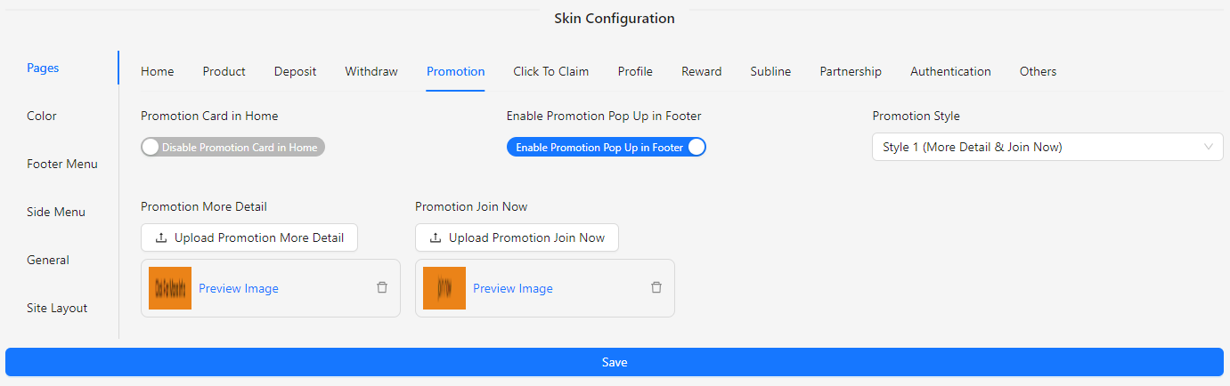
- Promotion Card in Home: Enable or disable the promotion card display on the home page.
- Enable Promotion Pop Up in Footer: Enable or disable the promotion pop-up in the footer.
- Promotion Style: Choose how you’d like your promotion to be presented on the site.
- Style 1 (More Detail & Join Now)
- Style 2 (More Detail)
- Promotion More Detail: Upload an image for the "More Detail" button.
- Promotion Join Now: Upload an image for the "Join Now" button.
Click To Claim
The Click To Claim section of the Skin Config allows you to customize the appearance and functionality of the Promotion page. This section includes options to manage and update the layout and visual elements to ensure that the Promotion page aligns with your site’s design and branding.
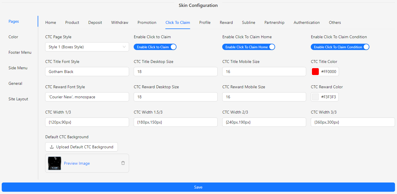
- CTC Page Style: Choose how the Click To Claim page will be displayed to users.
- Style 1: Boxes Style
- Style 2: Classic Promotion Style
- Enable Click to Claim: Enable or disable the Click To Claim feature.
- Enable Click To Claim Home: Enable or disable Click To Claim on the home page.
- Enable Click To Claim Condition: Enable or disable the conditions for Click To Claim.
- CTC Title Font Style: Input the font style for the title.
- CTC Title Desktop Size: Input the desktop size for the title.
- CTC Title Mobile Size: Input the mobile size for the title.
- CTC Title Color: Set the color for the title.
- CTC Reward Font Style: Input the font style for the reward text.
- CTC Reward Desktop Size: Input the desktop size for the reward text.
- CTC Reward Mobile Size: Input the mobile size for the reward text.
- CTC Reward Color: Set the color for the reward text.
- CTC Width 1/3: Set the width for the 1/3 column layout.
- CTC Width 1.5/3: Set the width for the 1.5/3 column layout.
- CTC Width 2/3: Set the width for the 2/3 column layout.
- CTC Width 3/3: Set the width for the 3/3 column layout.
- Default CTC Background: Upload an image for the default background.
Profile
The Profile section of the Skin Config allows you to customize the appearance and functionality of the Profile page. This section includes options to manage and update the layout and visual elements to ensure that the Profile page aligns with your site’s design and branding.
- Profile Style: Choose the profile style based on regional preferences.
- Style 1: Malaysia
- Style 2: Indonesia
- Style 3: Australia
- Bonus Winover in Profile: Option to show or hide the bonus winover in the profile.
- Profile Tab 1-10 Icon: Upload an icon for each profile tab.
- Profile Tab 1-10 Route: Assign a route to each profile tab.
- Home
- Profile
- Promotion
- Game Account
- Bank Account
- Deposit
- Withdrawal
- Order History
- Bet History
- Change Password
- Contact Us
- Referral System
- VIP Ranking
- Profile Tab 1-10 Label: Set a label for each profile tab.
Reward
The Reward section of the Skin Config allows you to customize the appearance and functionality of the Reward page. This section provides options to manage and update the layout and visual elements to ensure that the Reward page aligns with your site’s design and branding.
Component
The Component section within the Reward configuration allows you to manage and customize various reward-related components on your page. You can configure icons for different components like Ranking, Check In, Lucky Wheel, Rewards, Mailbox, and Mission to match your site’s theme and branding.
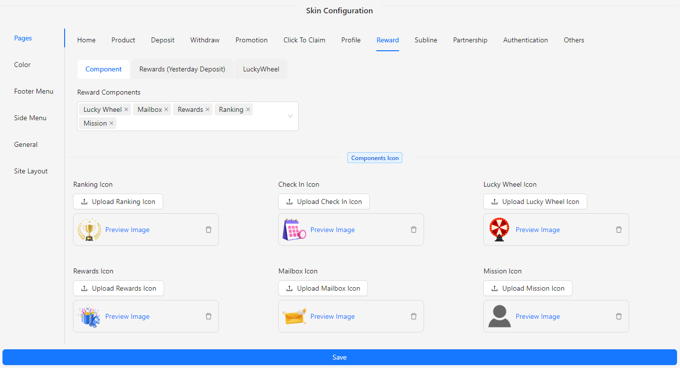
- Reward Components: Configure and manage the various reward-related components available on the page. Each component can be individually customized to match your site’s design and functionality needs.
- Components
- Ranking
- Check In
- Lucky Wheel
- Rewards
- Mailbox
- Mission
- Ranking Icon: Upload and set an icon for the Ranking component.
- Check In Icon: Upload and set an icon for the Check In component.
- Lucky Wheel Icon: Upload and set an icon for the Lucky Wheel component.
- Rewards Icon: Upload and set an icon for the Rewards component.
- Mailbox Icon: Upload and set an icon for the Mailbox component.
- Mission Icon: Upload and set an icon for the Mission component.
Rewards (Yesterday Deposit)
The Rewards (Yesterday Deposit) section allows you to customize the display and functionality of reward-related elements based on yesterday’s deposit activity.
-c2b4e11cbb151bb6de97e2d54905babb.png)
- Reward Total Boxes Show: Set the quantity of reward boxes to display on the page.
- Reward Background Image: Upload an image to serve as the background for the reward section.
- Reward Box Open Image: Upload an image to show when a reward box is open.
- Reward Box Close Image: Upload an image to show when a reward box is closed.
Lucky Wheel
The Lucky Wheel section allows you to customize the appearance and functionality of the Lucky Wheel feature on your site. You can adjust styles, manage images, and configure pop-ups to enhance the user experience.
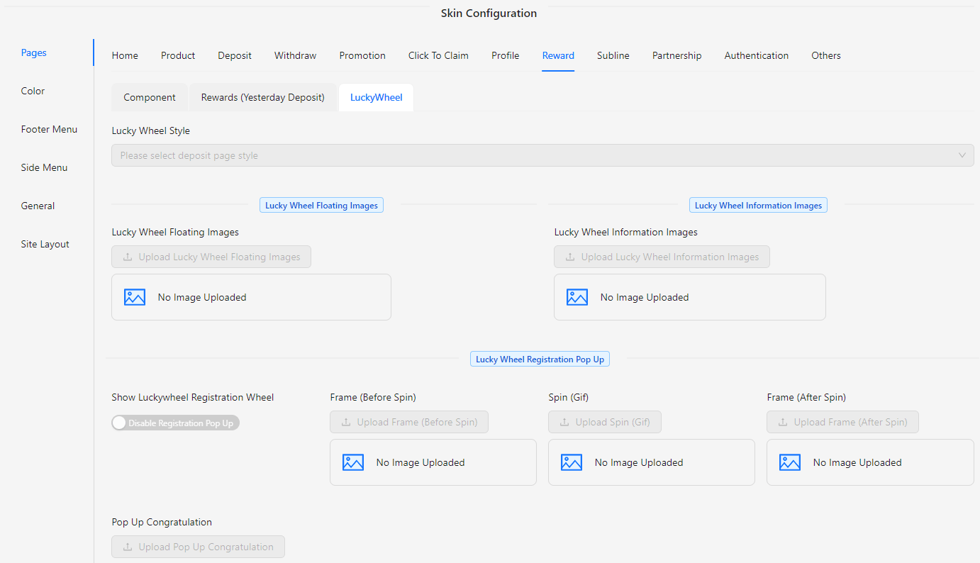
- Lucky Wheel Style: Choose the visual theme for the Lucky Wheel.
- Style 1 (Christmas)
- Style 2 (New Year)
- Lucky Wheel Floating Images: Upload images to display while the Lucky Wheel is spinning.
- Lucky Wheel Information Images: Upload images that provide information about the Lucky Wheel rewards or details.
- Lucky Wheel Registration Pop Up: Enable or disable the pop-up that appears for user registration related to the Lucky Wheel.
- Show Lucky Wheel Registration Wheel: Toggle the visibility of the registration wheel.
- Frame (Before Spin): Upload an image or gif to be shown before the wheel starts spinning.
- Spin (Gif): Upload a gif that represents the spinning action of the Lucky Wheel.
- Frame (After Spin): Upload an image or gif to be shown after the wheel finishes spinning.
- Pop Up Congratulation: Customize the congratulatory pop-up message or image that appears after a user spins the wheel.
- Banner: Configure and upload a banner for the Lucky Wheel section.
Subline
The Subline section of the Skin Config allows you to customize the display and functionality of subline elements on your site. This section provides options to manage the layout and visual appearance of subline elements to fit your site's design.
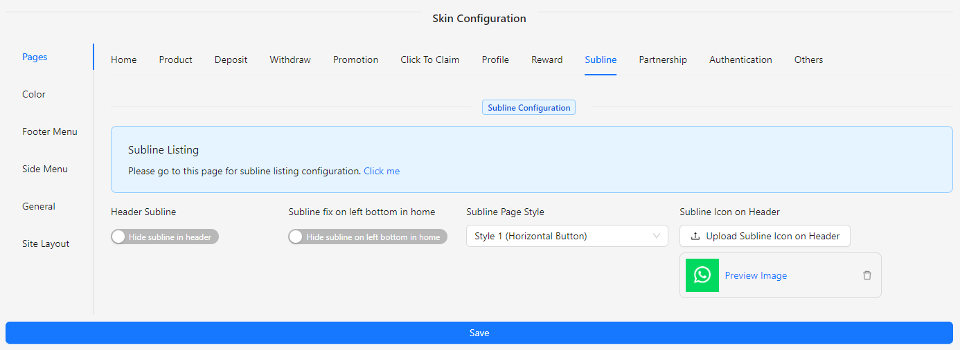
- Subline Listing: Click the Click me button to view or manage subline listings. Click me🔗
- Header Subline: Toggle to show or hide the subline header on the profile page.
- Subline Fix on Left Bottom in Home: Choose to fix the subline at the bottom left corner of the home page or hide it.
- Subline Page Style: Select the style for displaying sublines.
- Style 1 (Horizontal Button)
- Style 2 (Vertical Button)
- Subline Icon on Header: Upload an image to display as the subline icon on the header.
Partnership
The Partnership section of the Skin Config allows you to tailor the appearance and functionality of the partnership elements on your site. This section provides options to configure the layout, visual elements, and overall presentation to ensure it aligns with your site’s branding and design.
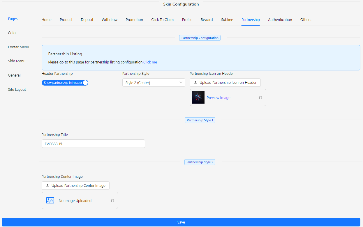
- Partnership Listing: Click the Click me button to view or manage partnership listings. Click me🔗
- Header Partnership: Toggle to show or hide the partnership header on the profile page.
- Partnership Style: Choose from available styles to customize the appearance of the partnership section.
- Partnership Icon on Header: Upload an image to use as the partnership icon displayed in the header.
- Partnership Title: Enter a title for the partnership section to be shown on the page.
- Partnership Center Image: Upload an image to be featured in the center of the partnership section.
Authentication
The Authentication section of the Skin Config allows you to customize the appearance and functionality of the authentication pages on your site. This section provides options to configure styles and visual elements for the sign-in, sign-up, and password change processes, ensuring they align with your site's branding and design.
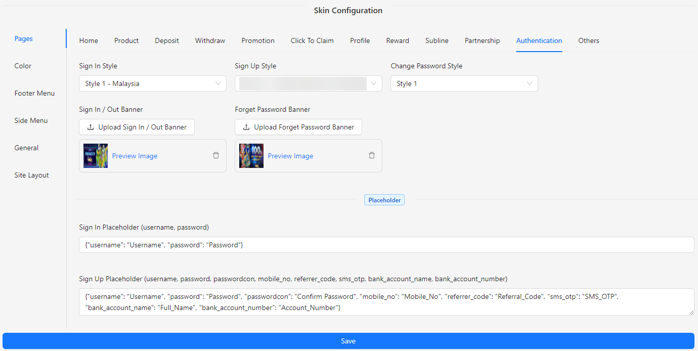
- Sign In Style: Choose the style for the sign-in page from available options.
- Sign Up Style: Select the style for the sign-up page from available options.
- Change Password Style: Pick the style for the change password page from available options.
- Sign In / Out Banner: Upload an image to be displayed on the sign-in or sign-out banner.
- Forget Password Banner: Upload an image to be used on the forget password banner.
- Sign In Placeholder (username, password): Customize the placeholder text for the sign-in fields.
Others
The Others section of the Skin Config provides additional customization options for various features on your site. This section allows you to configure and manage a range of components to ensure they fit seamlessly with your site's design and branding.
Live Chat
Live Chat: Manage settings for live chat functionality, including appearance.
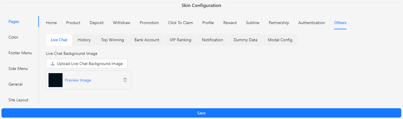
- Live Chat Background Image: Upload an image to set the background for the live chat feature.
History
History: Manage the style for transaction history.
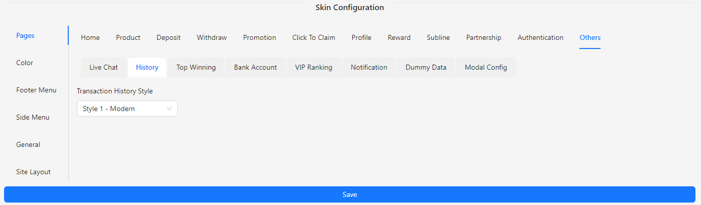
- Transaction History Style:
- Style 1 (Modern)
- Style 2 (Indonesia)
- Style 3 (Classic)
Top Winning
The Top Winning section allows you to manage the visibility and functionality of top winning displays on your site. You can enable or disable the feature to showcase top winning players or achievements, aligning with your site's design and user engagement goals.
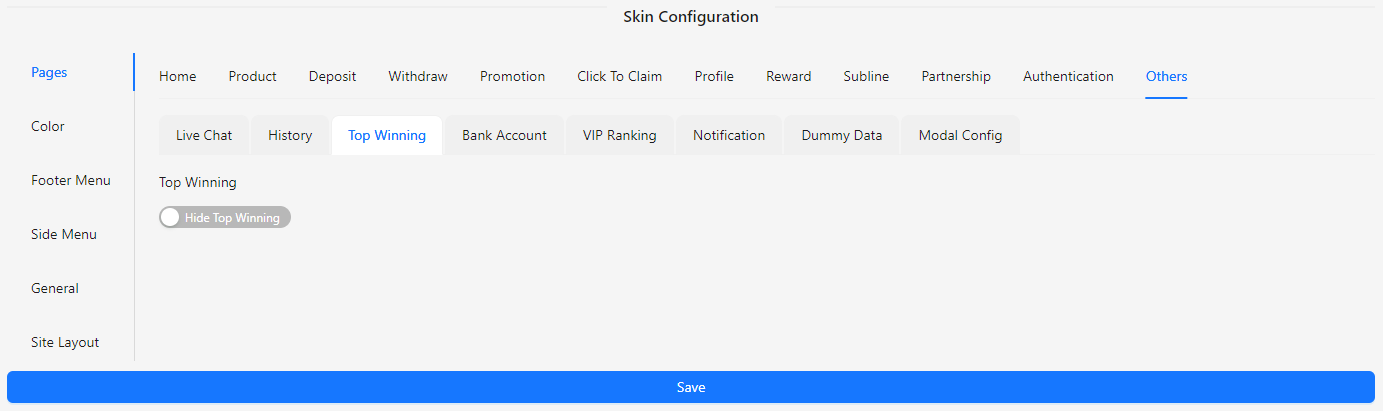
- Top Winning: Toggle to enable or disable the display of top winning information.
Bank Account
The Bank Account section allows you to customize the appearance and style of the bank account settings on your site. You can select from available styles to match the look and feel of your site.
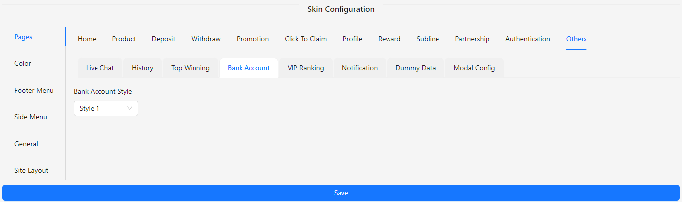
- Bank Account Style: Choose from the available styles to configure the bank account display.
VIP Ranking
The VIP Ranking section allows you to upload an image for displaying VIP rankings on your site. This section helps you customize the visual representation of VIP ranks to align with your site’s design.
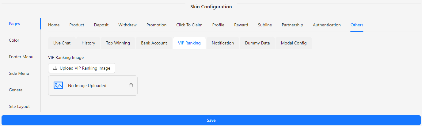
- VIP Ranking Image: Upload an image to represent VIP rankings.
Notification
The Notification section allows you to manage and customize the appearance and content of notifications on your site. This section provides options to display notifications, set titles and descriptions, and customize button texts and images.
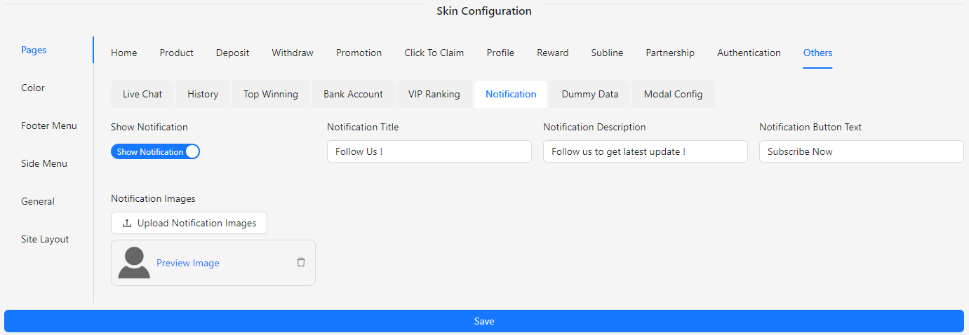
- Show Notification: Toggle to enable or disable notifications.
- Notification Title: Input the title for the notification.
- Notification Description: Provide a description for the notification.
- Notification Button Text: Set the text for the notification button.
- Notification Images: Upload images to be used in the notification.
Dummy Data
The Dummy Data section allows you to configure the display of dummy data on your site. This section provides options to set country codes, star ratings, and random values to ensure that the dummy data aligns with your site’s design and requirements.
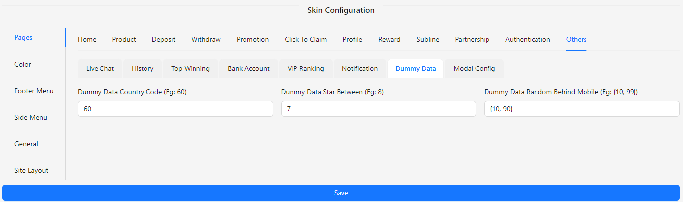
- Dummy Data Country Code: Input the country code for dummy data (e.g., 60).
- Dummy Data Star Between: Specify the range for star ratings (e.g., 8).
- Dummy Data Random Behind Mobile: Define random values for dummy data (e.g., 99).
Modal Config
The Modal Config section allows you to customize the appearance of modals on your site. This section provides options to set the background color, border color, and shadow color for modals, ensuring they match your site’s design and enhance the user experience.
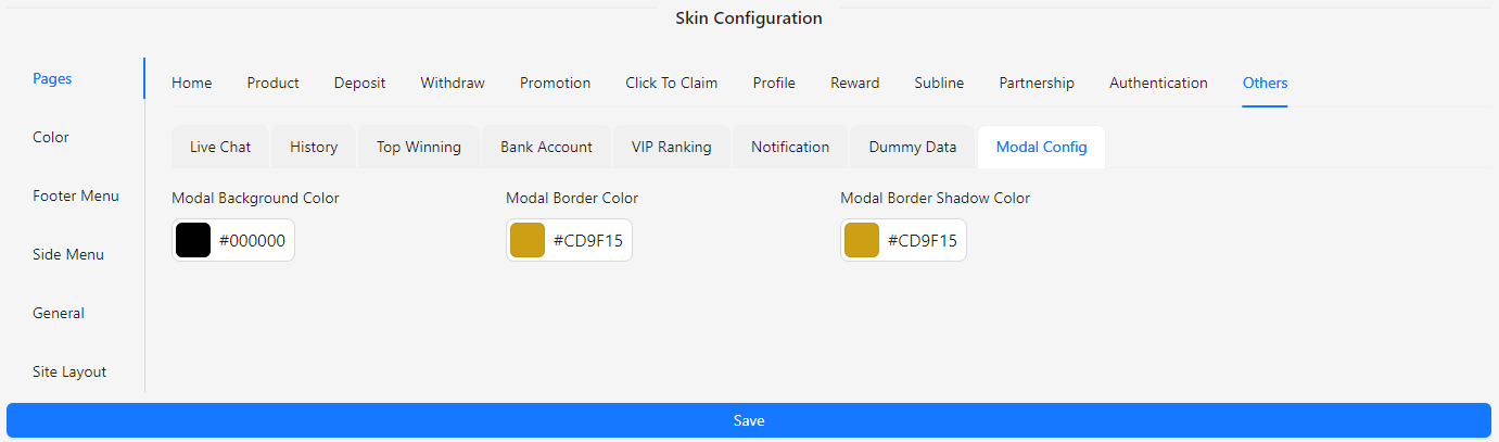
- Modal Background Color: Choose the background color for modals.
- Modal Border Color: Set the color of the modal border.
- Modal Border Shadow Color: Define the color for the modal border shadow.